Florita company logo design - wedesign360.com - design agency

FLORITA company logo design

COMPANY


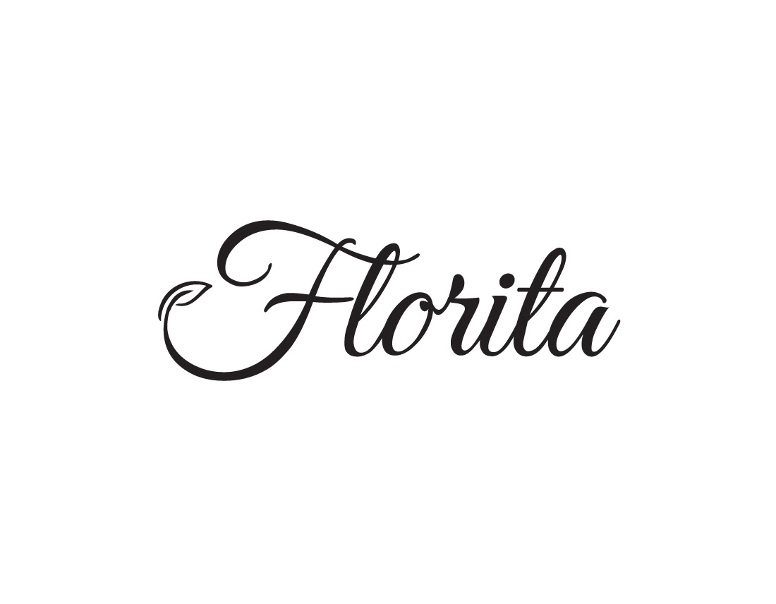
We made logo design for FLORITA – company, which is based in Vilnius, Lithuania. FLORITA provides all floristic service, binding bouquets, creating festival and wedding accessories. Client wanted the logo would look energetic, would show fast service and floristic character.

Our task was to make minimalistic and visible logo design, which has dynamic character.


PROBLEM


There are many competitors in this niche. We analyzed many companies which providing floristic services. Many floristic logos are too complicated, overcrowded by many colors, details. Also, some already do not suit for floristic theme what nowadays is pretty amazing too. Our task was to look through these examples, recognize, analyze problems and avoid them in creating logo design and to make the best we can.


LOGO DESIGN FEATURES


Simple. A simple logo design allows for easy recognition and allows the logo to be versatile & memorable. We created unique logo elements, so it’s not look like overdrawn. Memorable. Following closely behind the principle of simplicity, is that of memorability. An effective logo design should be memorable and this is achieved by having a simple, yet, appropriate logo. Appropriate – the logo describes what the company does. Versatile. An effective logo should be able to work across a variety of mediums and applications. The logo should be functional. For this reason a logo should be designed in vector format, to ensure that it can be scaled to any size. The logo should be able to work both in horizontal and vertical formats. We made it. PS. Logo design should be Timeless. An effective logo should be timeless – that is, it will endure the ages. Will the logo still be effective in 50 years? Hope grandchildren will answer it.


DESIGN ACCENT


Small leaf is all we needed to improve our simple and clean FLORITA logo design. We also tried other elements and style, and we chose the best one.


FONT


It was not hard to make a decision which font to choose making FLORITA logo design. We have collected tons of different fonts and after some time with our client, we have chosen font, which looks energetic, clean, dynamic and elegant.


COLORS


Black. We wanted to avoid very sweet and complicated image – font is quiet dynamic and groovy itself.


CONCLUSION


Firstly, we communicated with our client, listened to her, raised all priorities and potential problems above, analyzed many competitors, created logo design accent, selected the most suitable fonts and colors and in the end we left our client happy. But forgot to mention… Our client made us happy too, so we became partners plus we exchanged recommendations.

astreta logo design - wedesign360.com - design agency

ASTRETA company logo design

COMPANY


We made logo design for ASTRETA company, which is based in Kaunas, Lithuania. ASTRETA provides timber and log home services. Client wanted the logo would look visible, would show sharp character.

Our task was to make memorable logo design, which has a character.


PROBLEM


There are many competitors in this niche. We analyzed many companies which providing timber and log home services. Many logos are too complicated, overcrowded by many details and elements. Also, some already do not suit for timber theme what nowadays is pretty amazing too. Our task was to look through these examples, recognize, analyze problems and avoid them in our logo design and to make the best we can.


LOGO DESIGN FEATURES


Simple. A simple logo design allows for easy recognition and allows the logo to be versatile & memorable. We created unique logo elements, so it’s not look like overdrawn. Memorable. Following closely behind the principle of simplicity, is that of memorability. An effective logo design should be memorable and this is achieved by having a simple, yet, appropriate logo. Appropriate — the logo describes what the company does. Versatile. An effective logo should be able to work across a variety of mediums and applications. The logo should be functional. For this reason a logo should be designed in vector format, to ensure that it can be scaled to any size. The logo should be able to work both in horizontal and vertical formats. We made it. Logo design should be Timeless. An effective logo should be timeless – that is, it will endure the ages. Will the logo still be effective in 50 years? Hope grandchildren will answer it.


DESIGN ACCENT


Geometrical shapes. Symmetry gives ASTRETA logo what it needs – memorable image.


FONT


It was not hard to make a decision which font to choose making ASTRETA logo design. We have collected tons of different fonts and after some time with our client, we have chosen font, which looks simple and clean.


COLORS


Earth tones – best decision to show timber and nature.


CONCLUSION


Firstly, we communicated with our client, listened to her, raised all priorities and potential problems above, analyzed many competitors, created logo design accent, selected the most suitable fonts and colors and in the end we left our client happy. But forgot to mention… Our client made us happy too – he recommend us to his clients.

sps3 logo & print design - wedesign360.com - design agency

SPS Company logo design & print design

COMPANY


We made print design and logo design for SPS – building design studio. Client wanted the logo would look simple, memorable, unique, interesting.


PROBLEM


There are many competitors in this niche. We analyzed many building design studio logos. Many logos are too complicated, overcrowded by many details and elements. Also, some already do not suit for building design theme what nowadays is pretty amazing too. Our task was to look through these examples, recognize, analyze problems and avoid them in creating logo design and to make the best we can. Our client wanted to make print design on his bus.


LOGO DESIGN AND PRINT DESIGN FEATURES


Simple. A simple logo design allows for easy recognition and allows the logo to be versatile & memorable. We created unique logo elements, so it’s not look like overdrawn. Memorable. Following closely behind the principle of simplicity, is that of memorability. An effective logo design should be memorable and this is achieved by having a simple, yet, appropriate logo. Appropriate – the logo describes what the company does. Versatile. An effective logo should be able to work across a variety of mediums and applications. The logo should be functional. For this reason a logo should be designed in vector format, to ensure that it can be scaled to any size and will suit for print design machines. The logo should be able to work both in horizontal and vertical formats. We made it. Logo design should be Timeless. An effective logo should be timeless – that is, it will endure the ages. Will the logo still be effective in 50 years? Hope grandchildren will answer it.


DESIGN ACCENT


Cutted letters. Logo looks more interesting and mysterious then something is hidden. That is why people pay more attention to solve the rebus.


FONT


It was not hard to make a decision which font to choose making SPS logo design. We have collected tons of different fonts and after some time with our client, we have chosen font, which suits the best for building design studio and print design.


COLORS


Black, grey.


CONCLUSION


Firstly, we communicated with our client, listened to him, raised all priorities and potential problems above, analyzed many competitors, created logo design accent, print design on the bus, selected the most suitable fonts and colors and in the end we left our client happy. But forgot to mention… Our client made us happy too, so we became partners.

vezliukas child care center logo design - wedesign360.com - design agency - advertising agency

VEZLIUKAS Child Care Center logo design

COMPANY


We made logo design for VEZLIUKAS (turtle) – child care center. Client wanted the logo would look attractive to kids firstly, and for parents secondly.

Our task was to make memorable logo design, which has a juicy and colorful character.


PROBLEM


There are many competitors in this niche. We analyzed many companies which gives child care services. Many logos are too complicated, overcrowded by many details and elements. Also, some already do not suit for kindergarden theme what nowadays is pretty amazing too. Our task was to look through these examples, recognize, analyze problems and avoid them in creating logo design and to make the best we can.


LOGO DESIGN FEATURES


Simple. A simple logo design allows for easy recognition and allows the logo to be versatile & memorable. We created unique logo elements, so it’s not look like overdrawn. Memorable. Following closely behind the principle of simplicity, is that of memorability. An effective logo design should be memorable and this is achieved by having a simple, yet, appropriate logo. Appropriate – the logo describes what the company does. Versatile. An effective logo should be able to work across a variety of mediums and applications. The logo should be functional. For this reason a logo should be designed in vector format, to ensure that it can be scaled to any size. The logo should be able to work both in horizontal and vertical formats. We made it. Logo design should be Timeless. An effective logo should be timeless – that is, it will endure the ages. Will the logo still be effective in 50 years? Hope grandchildren will answer it.


DESIGN ACCENT


3D juicy effect. We made unique turtle character which may look like bubble gum, or juicy. That looks attractive to kids.


FONT


It was not hard to make a decision which font to choose making VEZLIUKAS logo design. We have collected tons of different fonts and after some time with our client, we have chosen font, which looks handwritten, a bit childish and clean.


COLORS


Bright colors – best decision to show cute turtle.


CONCLUSION


Firstly, we communicated with our client, listened to her, raised all priorities and potential problems above, analyzed many competitors, created logo design accent, selected the most suitable fonts and colors and in the end we left our client happy. But forgot to mention… Our client made us happy too – he recommend us to his clients and came back to us again.

stork sash windows print design& logo design e-shop design

STORK INTERIOR shop logo design & print design

COMPANY


We made e-shop design for STORK INTERIOR company, which products go to United Kingdom. STORK INTERIOR provides home made interior accessories.
Our task was to make unique and minimalistic and esthetic logo design and print design which gives warm impression.


PROBLEM


There are many competitors in this niche. We analyzed many interior shop design examples. Many logos are too complicated, overcrowded by many details and elements. Also, some already do not suit for interior shop theme what nowadays is pretty amazing too. Our task was to look through these examples, recognize, analyze problems and avoid them in creating logo design and to make the best we can. Also we made print design on labels.


LOGO DESIGN AND PRINT DESIGN FEATURES


Simple. A simple logo design allows for easy recognition and allows the logo to be versatile & memorable. We created unique logo elements, so it’s not look like overdrawn. Memorable. Following closely behind the principle of simplicity, is that of memorability. An effective logo design should be memorable and this is achieved by having a simple, yet, appropriate logo. Appropriate – the logo describes what the company does. Versatile. An effective logo should be able to work across a variety of mediums and applications. The logo should be functional. For this reason a logo should be designed in vector format, to ensure that it can be scaled to any size and will suit for print design machines. The logo should be able to work both in horizontal and vertical formats. We made it. Logo design should be Timeless. An effective logo should be timeless – that is, it will endure the ages. Will the logo still be effective in 50 years? Hope grandchildren will answer it.


DESIGN ACCENT


Stork silhouette.


FONT


It was not hard to make a decision which font to choose making STORK INTERIOR logo design. We have collected tons of different fonts and after some time with our client, we have chosen font, which suits the best for honey product and print design.


COLORS


Black and dark grey


CONCLUSION


Firstly, we communicated with our client, listened to him, raised all priorities and potential problems above, analyzed many competitors, created logo design accent, print design, selected the most suitable fonts and colors and in the end we left our client happy. But forgot to mention… Our client made us happy too, so we became partners.

daitrada logo design - wedesign360.com

DAITRADA company logo design

COMPANY


We made logo design for DAITRADA – company, which is based in Lithuania. DAITRADA provides all rental service, transport semi trucks and semi trailers sales. Client wanted the logo would look energetic, would show fast service and had an accent in it.
Our task was to make minimalistic and visible logo design, which has dynamic character.


PROBLEM


There are many competitors in this niche. We analyzed many companies which providing such services. Many company logos are too complicated, overcrowded by many colors, details. Also, some already do not suit for rental service theme what nowadays is pretty amazing too. Our task was to look through these examples, recognize, analyze problems and avoid them in creating logo design and to make the best we can.


LOGO DESIGN FEATURES


Simple. A simple logo design allows for easy recognition and allows the logo to be versatile & memorable. We created unique logo elements, so it’s not look like overdrawn. Memorable. Following closely behind the principle of simplicity, is that of memorability. An effective logo design should be memorable and this is achieved by having a simple, yet, appropriate logo. Appropriate – the logo describes what the company does. Versatile. An effective logo should be able to work across a variety of mediums and applications. The logo should be functional. For this reason a logo should be designed in vector format, to ensure that it can be scaled to any size. The logo should be able to work both in horizontal and vertical formats. We made it. PS. Logo design should be Timeless. An effective logo should be timeless – that is, it will endure the ages. Will the logo still be effective in 50 years? Hope grandchildren will answer it.


DESIGN ACCENT


Road figure is all we needed to improve our simple and clean DAITRADA logo design. We also tried other elements and style, and we chose the best one.


FONT


It was not hard to make a decision which font to choose making DAITRADA logo design. We have collected tons of different fonts and after some time with our client, we have chosen font, which looks energetic, clean, dynamic and elegant.


COLORS


Black and red. We wanted to avoid very sweet and complicated image – font is quiet static and heavy/bold.


CONCLUSION


Firstly, we communicated with our client, listened to her, raised all priorities and potential problems above, analyzed many competitors, created logo design accent, selected the most suitable fonts and colors and in the end we left our client happy. But forgot to mention… Our client made us happy too, so we became partners plus we exchanged recommendations.

vilniaus narai logo design print design wedesign360.com - design agency

VILNIAUS NARAI Company logo & print design

COMPANY


We made print design and logo design for VILNIAUS NARAI – diving company. Client wanted the logo would be memorable, look like a cartoon.


PROBLEM


There are many competitors in this niche. We analyzed many diving company logos. Many logos are too complicated, overcrowded by many details and elements. Also, some already do not suit for diving theme what nowadays is pretty amazing too. Our task was to look through these examples, recognize, analyze problems and avoid them in creating logo design and to make the best we can. Our client wanted to make iron print design on his equipment.


LOGO DESIGN AND PRINT DESIGN FEATURES


Simple. A simple logo design allows for easy recognition and allows the logo to be versatile & memorable. We created unique logo elements, so it’s not look like overdrawn. Memorable. Following closely behind the principle of simplicity, is that of memorability. An effective logo design should be memorable and this is achieved by having a simple, yet, appropriate logo. Appropriate – the logo describes what the company does. Versatile. An effective logo should be able to work across a variety of mediums and applications. The logo should be functional. For this reason a logo should be designed in vector format, to ensure that it can be scaled to any size and will suit for print design machines. The logo should be able to work both in horizontal and vertical formats. We made it. Logo design should be Timeless. An effective logo should be timeless – that is, it will endure the ages. Will the logo still be effective in 50 years? Hope grandchildren will answer it.


DESIGN ACCENT


Old style diving helmet illustration. Logo looks more attractive and memorable because old helmet has more details, used in many cartoons.


FONT


It was not hard to make a decision which font to choose making VILNIAUS NARAI logo design. We have collected tons of different fonts and after some time with our client, we have chosen font, which suits the best for diving company and print design.


COLORS


Black, grey.


CONCLUSION


Firstly, we communicated with our client, listened to him, raised all priorities and potential problems above, analyzed many competitors, created logo design accent, print design on the bus, selected the most suitable fonts and colors and in the end we left our client happy. But forgot to mention… Our client made us happy too, so we became partners.

henry company logo design - wedesign360.com - design agency

HENRY FLY FISHING company logo design

COMPANY


We made logo design for HENRY FLY FISHING – company, which is based in Montana, USA. HENRY FLY FISHING provides all fishing service, fishing clothing, accessories. Client wanted the logo would look simple, and character would have a fishing hook inside the logo.
Our task was to make minimalistic and visible logo design, which has a character.


PROBLEM


There are many competitors in this niche. We analyzed many companies which providing fishing services. Many fishing logos are too complicated, overcrowded by many colors, details. Also, some already do not suit for fishing theme what nowadays is pretty amazing too. Our task was to look through these examples, recognize, analyze problems and avoid them in creating logo design and to make the best we can.


LOGO DESIGN FEATURES


Simple. A simple logo design allows for easy recognition and allows the logo to be versatile & memorable. We created unique logo elements, so it’s not look like overdrawn. Memorable. Following closely behind the principle of simplicity, is that of memorability. An effective logo design should be memorable and this is achieved by having a simple, yet, appropriate logo. Appropriate – the logo describes what the company does. Versatile. An effective logo should be able to work across a variety of mediums and applications. The logo should be functional. For this reason a logo should be designed in vector format, to ensure that it can be scaled to any size. The logo should be able to work both in horizontal and vertical formats. We made it. PS. Logo design should be Timeless. An effective logo should be timeless – that is, it will endure the ages. Will the logo still be effective in 50 years? Hope grandchildren will answer it.


DESIGN ACCENT


Small hook that crosses letter H is all we needed to improve our simple and clean HENRY logo design. We also tried other elements and style, and we chose the best one.


FONT


It was not hard to make a decision which font to choose making HENRY logo design. We have collected tons of different fonts and after some time with our client, we have chosen font, which looks energetic, clean, strict and simple.


COLORS


Black and white. We wanted to avoid very sweet and complicated image – font is quiet strict and with direction.


CONCLUSION


Firstly, we communicated with our client, listened to her, raised all priorities and potential problems above, analyzed many competitors, created logo design accent, selected the most suitable fonts and colors and in the end we left our client happy. But forgot to mention… Our client made us happy too, so we became partners plus we exchanged recommendations.

stork sash windows logo design - wedesign360.com - design agency

STORK SASH WINDOWS company logo design

COMPANY


We made logo design for STORK SASH WINDOWS company, which makes heritage timber sash windows. Client wanted the logo would look clean, minimalistic and we would use stork silhouette and sash window somewhere.


PROBLEM


There are many competitors in this niche. We analyzed many windows manufacturing company logos. Many logos are too complicated, overcrowded by many details and elements. Also, some already do not suit for sash windows theme what nowadays is pretty amazing too. Our task was to look through these examples, recognize, analyze problems and avoid them in creating logo design and to make the best we can.


LOGO DESIGN FEATURES


Simple. A simple logo design allows for easy recognition and allows the logo to be versatile & memorable. We created unique logo elements, so it’s not look like overdrawn. Memorable. Following closely behind the principle of simplicity, is that of memorability. An effective logo design should be memorable and this is achieved by having a simple, yet, appropriate logo. Appropriate – the logo describes what the company does. Versatile. An effective logo should be able to work across a variety of mediums and applications. The logo should be functional. For this reason a logo should be designed in vector format, to ensure that it can be scaled to any size. The logo should be able to work both in horizontal and vertical formats. We made it. Logo design should be Timeless. An effective logo should be timeless – that is, it will endure the ages. Will the logo still be effective in 50 years? Hope grandchildren will answer it.


DESIGN ACCENT


Sash window – accent, which makes company exclusive. So we put the frame instead of letter o. Seems a part of the window is opened.


FONT


It was not hard to make a decision which font to choose making STORK SASH WINDOWS logo design. We have collected tons of different fonts and after some time with our client, we have chosen font, which looks simple and clean.


COLORS


Orange and black – client’s wish.


CONCLUSION


Firstly, we communicated with our client, listened to him, raised all priorities and potential problems above, analyzed many competitors, created logo design accent, selected the most suitable fonts and colors and in the end we left our client happy. But forgot to mention… Our client made us happy too, so we became partners.