Archive

sps3 logo & print design - wedesign360.com - design agency

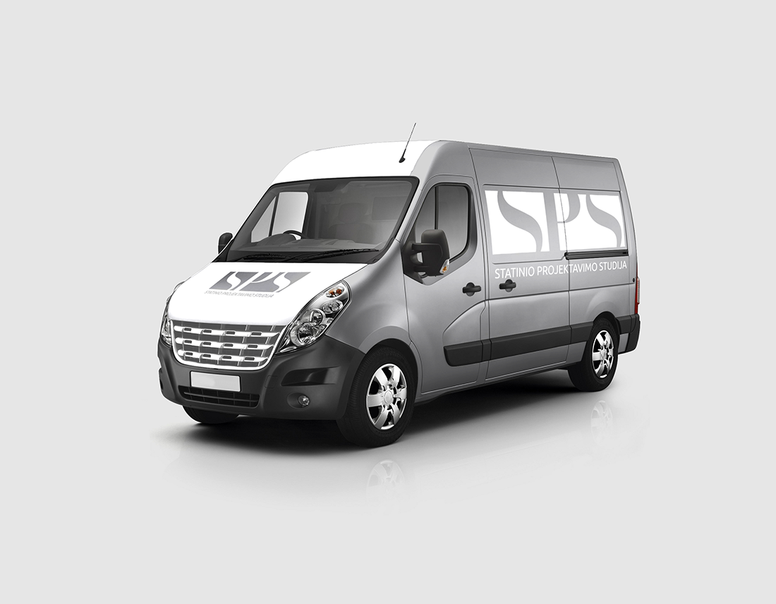
SPS Company logo design & print design

COMPANY


We made print design and logo design for SPS – building design studio. Client wanted the logo would look simple, memorable, unique, interesting.


PROBLEM


There are many competitors in this niche. We analyzed many building design studio logos. Many logos are too complicated, overcrowded by many details and elements. Also, some already do not suit for building design theme what nowadays is pretty amazing too. Our task was to look through these examples, recognize, analyze problems and avoid them in creating logo design and to make the best we can. Our client wanted to make print design on his bus.


LOGO DESIGN AND PRINT DESIGN FEATURES


Simple. A simple logo design allows for easy recognition and allows the logo to be versatile & memorable. We created unique logo elements, so it’s not look like overdrawn. Memorable. Following closely behind the principle of simplicity, is that of memorability. An effective logo design should be memorable and this is achieved by having a simple, yet, appropriate logo. Appropriate – the logo describes what the company does. Versatile. An effective logo should be able to work across a variety of mediums and applications. The logo should be functional. For this reason a logo should be designed in vector format, to ensure that it can be scaled to any size and will suit for print design machines. The logo should be able to work both in horizontal and vertical formats. We made it. Logo design should be Timeless. An effective logo should be timeless – that is, it will endure the ages. Will the logo still be effective in 50 years? Hope grandchildren will answer it.


DESIGN ACCENT


Cutted letters. Logo looks more interesting and mysterious then something is hidden. That is why people pay more attention to solve the rebus.


FONT


It was not hard to make a decision which font to choose making SPS logo design. We have collected tons of different fonts and after some time with our client, we have chosen font, which suits the best for building design studio and print design.


COLORS


Black, grey.


CONCLUSION


Firstly, we communicated with our client, listened to him, raised all priorities and potential problems above, analyzed many competitors, created logo design accent, print design on the bus, selected the most suitable fonts and colors and in the end we left our client happy. But forgot to mention… Our client made us happy too, so we became partners.

belomeda print design - wedesign360.com - design agency

MEDICO Company Calendar print design

COMPANY


We made print design and logo design for BELOMEDA dental company. Client wanted the logo would look clean, unique and we would make 3D effect.


PROBLEM


There are many competitors in this niche. We analyzed many dental company logos. Many logos are too complicated, overcrowded by many details and elements. Also, some already do not suit for sash windows theme what nowadays is pretty amazing too. Our task was to look through these examples, recognize, analyze problems and avoid them in creating logo design and to make the best we can. Also we made calendar print design.


LOGO DESIGN AND PRINT DESIGN FEATURES


Simple. A simple logo design allows for easy recognition and allows the logo to be versatile & memorable. We created unique logo elements, so it’s not look like overdrawn. Memorable. Following closely behind the principle of simplicity, is that of memorability. An effective logo design should be memorable and this is achieved by having a simple, yet, appropriate logo. Appropriate – the logo describes what the company does. Versatile. An effective logo should be able to work across a variety of mediums and applications. The logo should be functional. For this reason a logo should be designed in vector format, to ensure that it can be scaled to any size and will suit for print design machines. The logo should be able to work both in horizontal and vertical formats. We made it. Logo design should be Timeless. An effective logo should be timeless – that is, it will endure the ages. Will the logo still be effective in 50 years? Hope grandchildren will answer it.


DESIGN ACCENT


Heart shape – shows that company pays attention to clients.


FONT


It was not hard to make a decision which font to choose making BELOMEDA logo design. We have collected tons of different fonts and after some time with our client, we have chosen font, which suits the best for dental company and print design.


COLORS


From light blue to dark blue.


CONCLUSION


Firstly, we communicated with our client, listened to him, raised all priorities and potential problems above, analyzed many competitors, created logo design accent, print design,selected the most suitable fonts and colors and in the end we left our client happy. But forgot to mention… Our client made us happy too, so we became partners.

stork sash windows print design& logo design e-shop design

STORK INTERIOR shop logo design & print design

COMPANY


We made e-shop design for STORK INTERIOR company, which products go to United Kingdom. STORK INTERIOR provides home made interior accessories.
Our task was to make unique and minimalistic and esthetic logo design and print design which gives warm impression.


PROBLEM


There are many competitors in this niche. We analyzed many interior shop design examples. Many logos are too complicated, overcrowded by many details and elements. Also, some already do not suit for interior shop theme what nowadays is pretty amazing too. Our task was to look through these examples, recognize, analyze problems and avoid them in creating logo design and to make the best we can. Also we made print design on labels.


LOGO DESIGN AND PRINT DESIGN FEATURES


Simple. A simple logo design allows for easy recognition and allows the logo to be versatile & memorable. We created unique logo elements, so it’s not look like overdrawn. Memorable. Following closely behind the principle of simplicity, is that of memorability. An effective logo design should be memorable and this is achieved by having a simple, yet, appropriate logo. Appropriate – the logo describes what the company does. Versatile. An effective logo should be able to work across a variety of mediums and applications. The logo should be functional. For this reason a logo should be designed in vector format, to ensure that it can be scaled to any size and will suit for print design machines. The logo should be able to work both in horizontal and vertical formats. We made it. Logo design should be Timeless. An effective logo should be timeless – that is, it will endure the ages. Will the logo still be effective in 50 years? Hope grandchildren will answer it.


DESIGN ACCENT


Stork silhouette.


FONT


It was not hard to make a decision which font to choose making STORK INTERIOR logo design. We have collected tons of different fonts and after some time with our client, we have chosen font, which suits the best for honey product and print design.


COLORS


Black and dark grey


CONCLUSION


Firstly, we communicated with our client, listened to him, raised all priorities and potential problems above, analyzed many competitors, created logo design accent, print design, selected the most suitable fonts and colors and in the end we left our client happy. But forgot to mention… Our client made us happy too, so we became partners.

vilniaus narai logo design print design wedesign360.com - design agency

VILNIAUS NARAI Company logo & print design

COMPANY


We made print design and logo design for VILNIAUS NARAI – diving company. Client wanted the logo would be memorable, look like a cartoon.


PROBLEM


There are many competitors in this niche. We analyzed many diving company logos. Many logos are too complicated, overcrowded by many details and elements. Also, some already do not suit for diving theme what nowadays is pretty amazing too. Our task was to look through these examples, recognize, analyze problems and avoid them in creating logo design and to make the best we can. Our client wanted to make iron print design on his equipment.


LOGO DESIGN AND PRINT DESIGN FEATURES


Simple. A simple logo design allows for easy recognition and allows the logo to be versatile & memorable. We created unique logo elements, so it’s not look like overdrawn. Memorable. Following closely behind the principle of simplicity, is that of memorability. An effective logo design should be memorable and this is achieved by having a simple, yet, appropriate logo. Appropriate – the logo describes what the company does. Versatile. An effective logo should be able to work across a variety of mediums and applications. The logo should be functional. For this reason a logo should be designed in vector format, to ensure that it can be scaled to any size and will suit for print design machines. The logo should be able to work both in horizontal and vertical formats. We made it. Logo design should be Timeless. An effective logo should be timeless – that is, it will endure the ages. Will the logo still be effective in 50 years? Hope grandchildren will answer it.


DESIGN ACCENT


Old style diving helmet illustration. Logo looks more attractive and memorable because old helmet has more details, used in many cartoons.


FONT


It was not hard to make a decision which font to choose making VILNIAUS NARAI logo design. We have collected tons of different fonts and after some time with our client, we have chosen font, which suits the best for diving company and print design.


COLORS


Black, grey.


CONCLUSION


Firstly, we communicated with our client, listened to him, raised all priorities and potential problems above, analyzed many competitors, created logo design accent, print design on the bus, selected the most suitable fonts and colors and in the end we left our client happy. But forgot to mention… Our client made us happy too, so we became partners.

restaurant menu board

HEALTHY restaurant board menu design

COMPANY


We made healthy menu board design for one SWITZERLAND restaurant. CEO wanted the board would look clean, minimalistic, illustrated and suit for the brand.


PROBLEM


There are many competitors in this niche. We analyzed many restaurant board designs. Many of them are too complicated, overcrowded by many details and elements. Also, some already do not suit for tourists to read what nowadays is pretty amazing too. Our task was to look through these examples, recognize, analyze problems and avoid them in creating design and to make the best we can.


BOARD MENU DESIGN FEATURES


Simple. A simple design allows for easy recognition and allows the board menu to be versatile & memorable. We created unique illustrations, so it’s not look like overdrawn. Memorable. Following closely behind the principle of simplicity, is that of memorability. An effective board menu design should be memorable and this is achieved by having a simple, yet, appropriate design. Appropriate – the board menu describes exactly what customer has to buy. Versatile. An effective design should be able to work across a variety of people. The board menu design should be functional. For this reason we designed it in a vector format, to ensure that it can be scaled to any size. The board should be able to work both in horizontal and vertical formats. We made it. Also design should be Timeless. Will the board menu design still be effective in 50 years? Hope grandchildren will answer it.


DESIGN ACCENT


Cartoonish style and illustrations makes board look stylish, and more understandable.


FONT


It was not hard to make a decision which font to choose making this board. We have collected tons of different fonts and after some time with our client, we have chosen font, which looks simple and clean.


COLORS


Simple – client’s wish.


CONCLUSION


Firstly, we communicated with our client, listened to him, raised all priorities and potential problems above, analyzed many competitors, created board design accent, selected the most suitable fonts and colors and in the end we left our client happy.

feisty company logo & print design - wedesign360.com - design agency

FEISTY shop logo design & print design

COMPANY


We made print design and logo design for FEISTY – women’s clothing store. Client wanted the logo would look clean, dynamic and feminine.


PROBLEM


There are many competitors in this niche. We analyzed many shop company logos. Many logos are too complicated, overcrowded by many details and elements. Also, some already do not suit for women’s clothing store theme what nowadays is pretty amazing too. Our task was to look through these examples, recognize, analyze problems and avoid them in creating logo design and to make the best we can. We made print design on store doors.


LOGO DESIGN AND PRINT DESIGN FEATURES


Simple. A simple logo design allows for easy recognition and allows the logo to be versatile & memorable. We created unique logo elements, so it’s not look like overdrawn. Memorable. Following closely behind the principle of simplicity, is that of memorability. An effective logo design should be memorable and this is achieved by having a simple, yet, appropriate logo. Appropriate – the logo describes what the company does. Versatile. An effective logo should be able to work across a variety of mediums and applications. The logo should be functional. For this reason a logo should be designed in vector format, to ensure that it can be scaled to any size and will suit for print design machines. The logo should be able to work both in horizontal and vertical formats. We made it. Logo design should be Timeless. An effective logo should be timeless – that is, it will endure the ages. Will the logo still be effective in 50 years? Hope grandchildren will answer it.


DESIGN ACCENT


Women hair. Hyperbolyzed and dynamic women’s boosted hair shows energetic women and her femininity.


FONT


It was not hard to make a decision which font to choose making FEISTY logo design. We have collected tons of different fonts and after some time with our client, we have chosen font, which suits the best for dental company and print design.


COLORS


Black.


CONCLUSION


Firstly, we communicated with our client, listened to him, raised all priorities and potential problems above, analyzed many competitors, created logo design accent, print design, selected the most suitable fonts and colors and in the end we left our client happy. But forgot to mention… Our client made us happy too, so we became partners.

oak sash windows company print design - wedesign360.com - design agency

OAK SASH WINDOWS Company logo & print design

COMPANY


We made print design and logo design for for very strong sash windows company, which production goes to many countries. Our task was to make unique and specific design which suits just for oak sash window products.


PROBLEM


There are many competitors in this niche. We analyzed many windows manufacturing  company logos. Many logos are too complicated, overcrowded by many details and elements. Also, some already do not suit for windows store theme what nowadays is pretty amazing too. Our task was to look through these examples, recognize, analyze problems and avoid them in creating logo design and to make the best we can. We made print design on oak wood.


LOGO DESIGN AND PRINT DESIGN FEATURES


Simple. A simple logo design allows for easy recognition and allows the logo to be versatile & memorable. We created unique logo elements, so it’s not look like overdrawn. Memorable. Following closely behind the principle of simplicity, is that of memorability. An effective logo design should be memorable and this is achieved by having a simple, yet, appropriate logo. Appropriate – the logo describes what the company does. Versatile. An effective logo should be able to work across a variety of mediums and applications. The logo should be functional. For this reason a logo should be designed in vector format, to ensure that it can be scaled to any size and will suit for print design machines. The logo should be able to work both in horizontal and vertical formats. We made it. Logo design should be Timeless. An effective logo should be timeless – that is, it will endure the ages. Will the logo still be effective in 50 years? Hope grandchildren will answer it.


DESIGN ACCENT


Firstly we wanted to use acorn – oak’s seed as the main accent, but our client wanted to show clear message to his clients about his products. Then we decided to take an oak tree – it’s clear and obvious object without any metaphors. Oak tree has all elements we need: acorn, oak leaf and branches. In the end we used those elements in creating logo design and print design.


FONT


Font played very strong role to represent old tradition company, which makes high quality products. Our task was to create elegant impression, so we decided to use classic font to create old tradition, clean, elegant

logo design and print design look.


COLORS


Natural green, natural brown.


CONCLUSION


Firstly, we communicated with our client, listened to him, raised all priorities and potential problems above, analyzed many competitors, created logo design accent, print design, selected the most suitable fonts and colors and in the end we left our client happy. But forgot to mention… Our client made us happy too, so we became partners.