


HEALTHY restaurant board menu design
COMPANY
We made healthy menu board design for one SWITZERLAND restaurant. CEO wanted the board would look clean, minimalistic, illustrated and suit for the brand.
PROBLEM
There are many competitors in this niche. We analyzed many restaurant board designs. Many of them are too complicated, overcrowded by many details and elements. Also, some already do not suit for tourists to read what nowadays is pretty amazing too. Our task was to look through these examples, recognize, analyze problems and avoid them in creating design and to make the best we can.
BOARD MENU DESIGN FEATURES
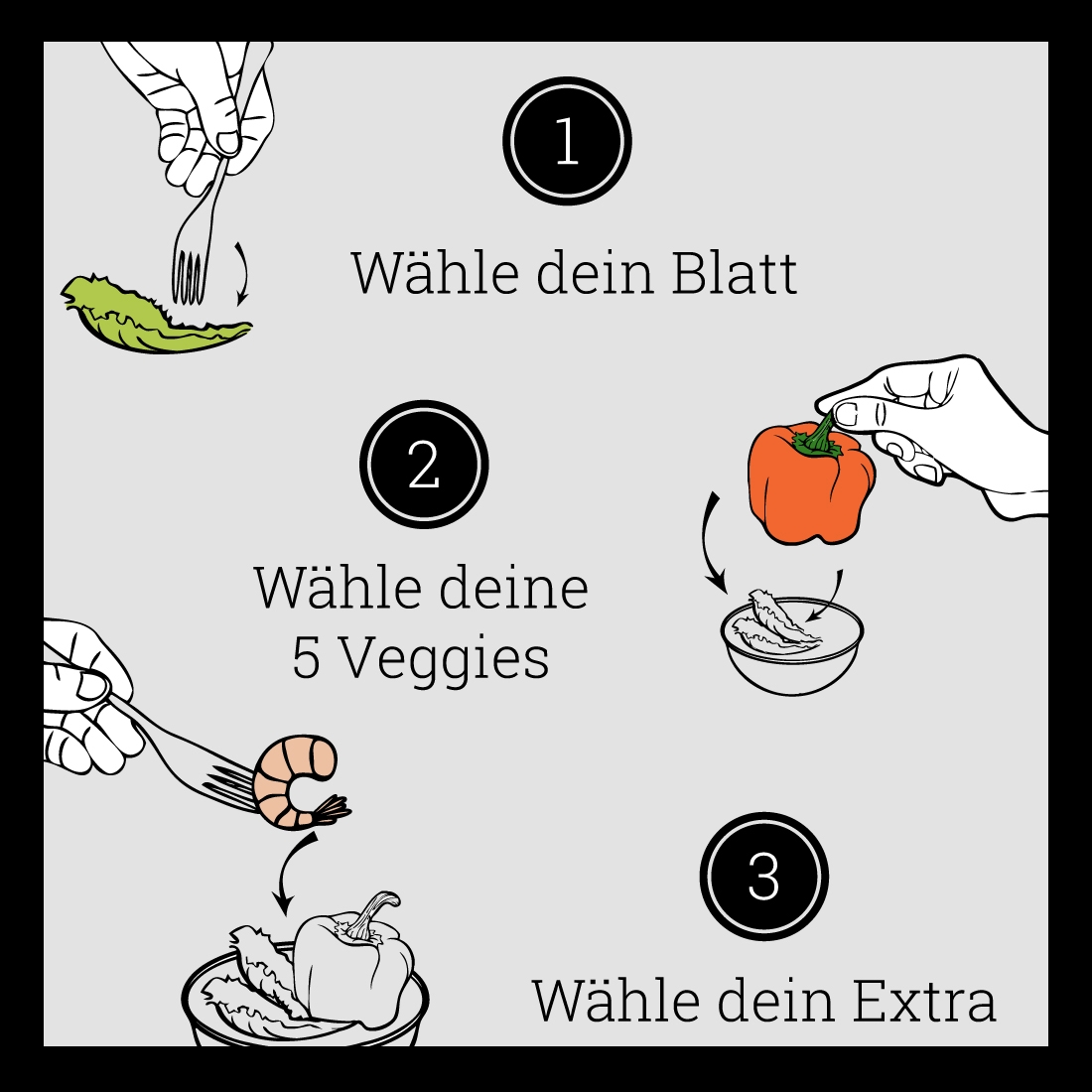
Simple. A simple design allows for easy recognition and allows the board menu to be versatile & memorable. We created unique illustrations, so it’s not look like overdrawn. Memorable. Following closely behind the principle of simplicity, is that of memorability. An effective board menu design should be memorable and this is achieved by having a simple, yet, appropriate design. Appropriate – the board menu describes exactly what customer has to buy. Versatile. An effective design should be able to work across a variety of people. The board menu design should be functional. For this reason we designed it in a vector format, to ensure that it can be scaled to any size. The board should be able to work both in horizontal and vertical formats. We made it. Also design should be Timeless. Will the board menu design still be effective in 50 years? Hope grandchildren will answer it.
DESIGN ACCENT
Cartoonish style and illustrations makes board look stylish, and more understandable.
FONT
It was not hard to make a decision which font to choose making this board. We have collected tons of different fonts and after some time with our client, we have chosen font, which looks simple and clean.
COLORS
Simple – client’s wish.
CONCLUSION
Firstly, we communicated with our client, listened to him, raised all priorities and potential problems above, analyzed many competitors, created board design accent, selected the most suitable fonts and colors and in the end we left our client happy.
Date
December 16, 2014
Category
Print projects