

We made print design and logo design for FEISTY – women’s clothing store. Client wanted the logo would look clean, dynamic and feminine.
There are many competitors in this niche. We analyzed many shop company logos. Many logos are too complicated, overcrowded by many details and elements. Also, some already do not suit for women’s clothing store theme what nowadays is pretty amazing too. Our task was to look through these examples, recognize, analyze problems and avoid them in creating logo design and to make the best we can. We made print design on store doors.
Simple. A simple logo design allows for easy recognition and allows the logo to be versatile & memorable. We created unique logo elements, so it’s not look like overdrawn. Memorable. Following closely behind the principle of simplicity, is that of memorability. An effective logo design should be memorable and this is achieved by having a simple, yet, appropriate logo. Appropriate – the logo describes what the company does. Versatile. An effective logo should be able to work across a variety of mediums and applications. The logo should be functional. For this reason a logo should be designed in vector format, to ensure that it can be scaled to any size and will suit for print design machines. The logo should be able to work both in horizontal and vertical formats. We made it. Logo design should be Timeless. An effective logo should be timeless – that is, it will endure the ages. Will the logo still be effective in 50 years? Hope grandchildren will answer it.
Women hair. Hyperbolyzed and dynamic women’s boosted hair shows energetic women and her femininity.
It was not hard to make a decision which font to choose making FEISTY logo design. We have collected tons of different fonts and after some time with our client, we have chosen font, which suits the best for dental company and print design.
Black.
Firstly, we communicated with our client, listened to him, raised all priorities and potential problems above, analyzed many competitors, created logo design accent, print design, selected the most suitable fonts and colors and in the end we left our client happy. But forgot to mention… Our client made us happy too, so we became partners.
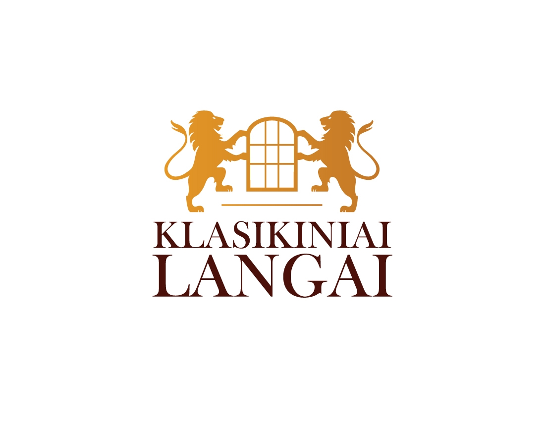
We made print design and logo design for for very strong sash windows company, which production goes to many countries. Our task was to make unique and specific design which suits just for oak sash window products.
There are many competitors in this niche. We analyzed many windows manufacturing company logos. Many logos are too complicated, overcrowded by many details and elements. Also, some already do not suit for windows store theme what nowadays is pretty amazing too. Our task was to look through these examples, recognize, analyze problems and avoid them in creating logo design and to make the best we can. We made print design on oak wood.
Simple. A simple logo design allows for easy recognition and allows the logo to be versatile & memorable. We created unique logo elements, so it’s not look like overdrawn. Memorable. Following closely behind the principle of simplicity, is that of memorability. An effective logo design should be memorable and this is achieved by having a simple, yet, appropriate logo. Appropriate – the logo describes what the company does. Versatile. An effective logo should be able to work across a variety of mediums and applications. The logo should be functional. For this reason a logo should be designed in vector format, to ensure that it can be scaled to any size and will suit for print design machines. The logo should be able to work both in horizontal and vertical formats. We made it. Logo design should be Timeless. An effective logo should be timeless – that is, it will endure the ages. Will the logo still be effective in 50 years? Hope grandchildren will answer it.
Firstly we wanted to use acorn – oak’s seed as the main accent, but our client wanted to show clear message to his clients about his products. Then we decided to take an oak tree – it’s clear and obvious object without any metaphors. Oak tree has all elements we need: acorn, oak leaf and branches. In the end we used those elements in creating logo design and print design.
Font played very strong role to represent old tradition company, which makes high quality products. Our task was to create elegant impression, so we decided to use classic font to create old tradition, clean, elegant
logo design and print design look.
Natural green, natural brown.
Firstly, we communicated with our client, listened to him, raised all priorities and potential problems above, analyzed many competitors, created logo design accent, print design, selected the most suitable fonts and colors and in the end we left our client happy. But forgot to mention… Our client made us happy too, so we became partners.
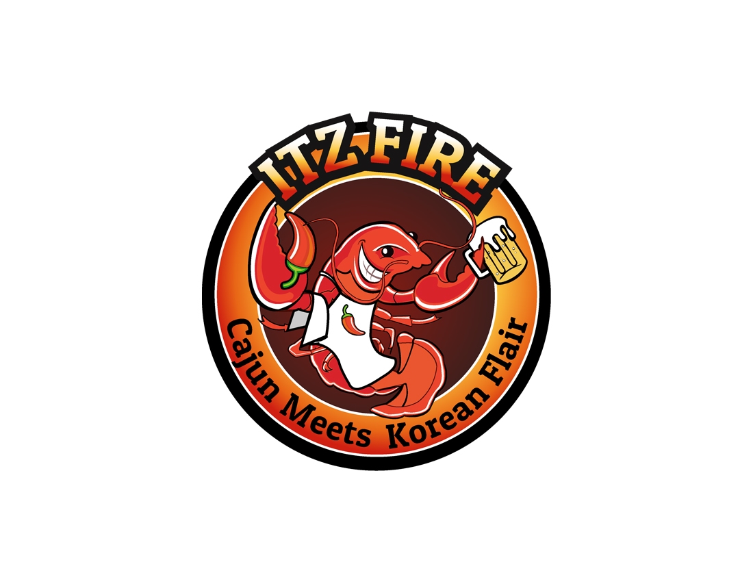
We made logo design for ITZ FIRE restaurant, which is based in New York. Client wanted the logo would look spicy, hot and would look like a cartoon.
Our task was to make memorable logo design, which has a eye-catching character.
There are many competitors in this niche. We analyzed many restaurant logos. Many of them are made without professional drawing skills. Also, some already do not suit for restaurant theme what nowadays is pretty amazing too. Our task was to look through these examples, recognize, analyze problems and avoid them in creating logo design and to make the best we can.
Simple. A simple logo design allows for easy recognition and allows the logo to be versatile & memorable. We created unique logo elements, so it’s not look like overdrawn. Memorable. Following closely behind the principle of simplicity, is that of memorability. An effective logo design should be memorable and this is achieved by having a simple, yet, appropriate logo. Appropriate – the logo describes what the company does. Versatile. An effective logo should be able to work across a variety of mediums and applications. The logo should be functional. For this reason a logo should be designed in vector format, to ensure that it can be scaled to any size. The logo should be able to work both in horizontal and vertical formats. We made it. Logo design should be Timeless. An effective logo should be timeless – that is, it will endure the ages. Will the logo still be effective in 50 years? Hope grandchildren will answer it.
Chilli pepper. You can see it instead of cancer tongs or on cancer character’s apron. Memorable logo design.
It was not hard to make a decision which font to choose making ITZ FIRE logo design. We have collected tons of different fonts and after some time with our client, we have chosen font, which looks good in signboard and is bold.
Chili pepper and fire colors make logo look spicy. Also claret color. It is found to be the most appetizing color. That is why we used this trick.
Firstly, we communicated with our client, listened to him, raised all priorities and potential problems above, analyzed many competitors, created logo design accent, selected the most suitable fonts and colors and in the end we left our client happy.
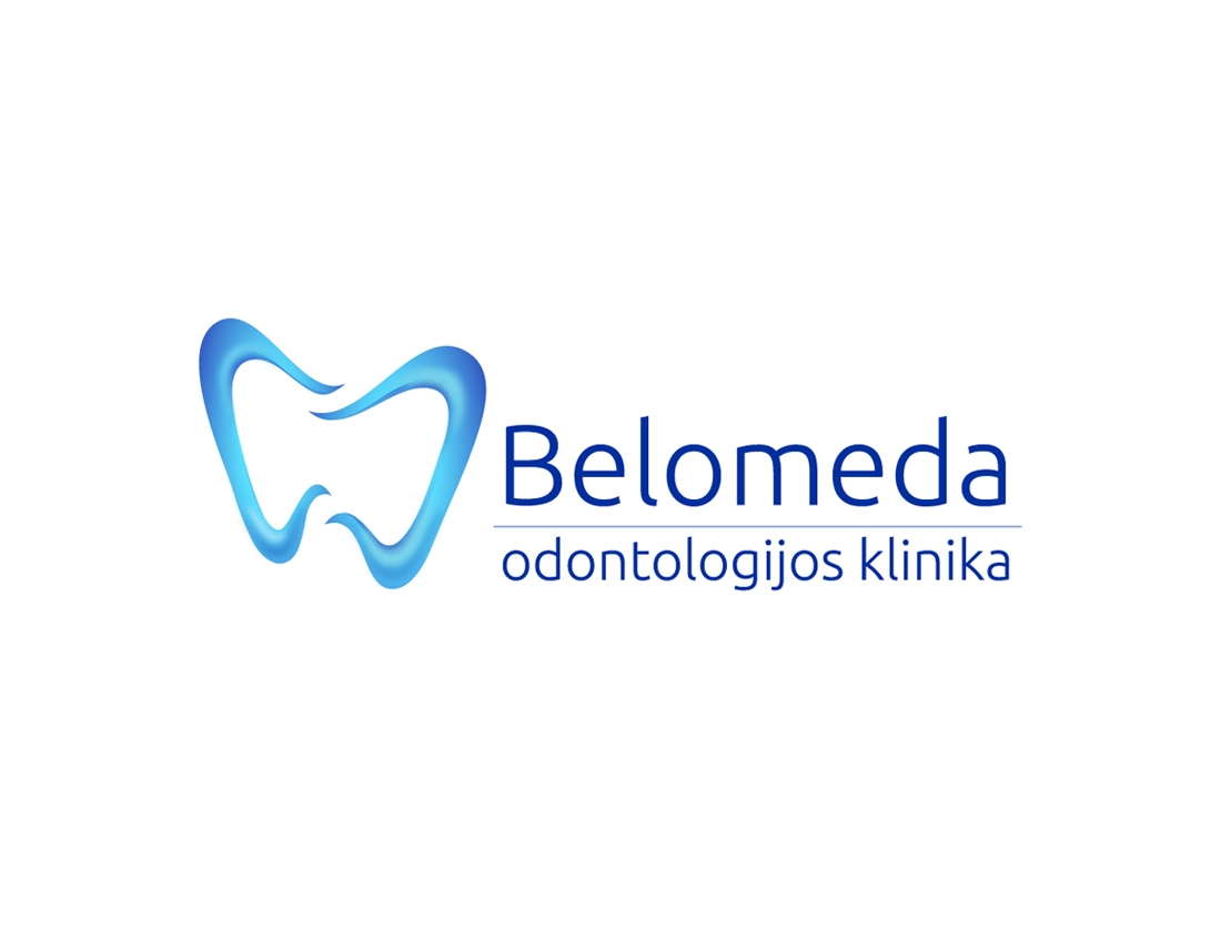
We made logo design for BELOMEDA – dental company. Client wanted the logo would look clean, unique and we would make 3D effect.
There are many competitors in this niche. We analyzed many dental company logos. Many logos are too complicated, overcrowded by many details and elements. Also, some already do not suit for dental theme what nowadays is pretty amazing too. Our task was to look through these examples, recognize, analyze problems and avoid them in creating logo design and to make the best we can.
Simple. A simple logo design allows for easy recognition and allows the logo to be versatile & memorable. We created unique logo elements, so it’s not look like overdrawn. Memorable. Following closely behind the principle of simplicity, is that of memorability. An effective logo design should be memorable and this is achieved by having a simple, yet, appropriate logo. Appropriate – the logo describes what the company does. Versatile. An effective logo should be able to work across a variety of mediums and applications. The logo should be functional. For this reason a logo should be designed in vector format, to ensure that it can be scaled to any size. The logo should be able to work both in horizontal and vertical formats. We made it. Logo design should be Timeless. An effective logo should be timeless – that is, it will endure the ages. Will the logo still be effective in 50 years? Hope grandchildren will answer it.
Heart shape – shows that company pays attention to clients.
It was not hard to make a decision which font to choose making BELOMEDA logo design. We have collected tons of different fonts and after some time with our client, we have chosen font, which suits the best for dental company.
From light blue to dark blue.
Firstly, we communicated with our client, listened to him, raised all priorities and potential problems above, analyzed many competitors, created logo design accent, selected the most suitable fonts and colors and in the end we left our client happy. But forgot to mention… Our client made us happy too, so we became partners.