Archive
HERITAGE TIMBER SASH WINDOWS website
COMPANY
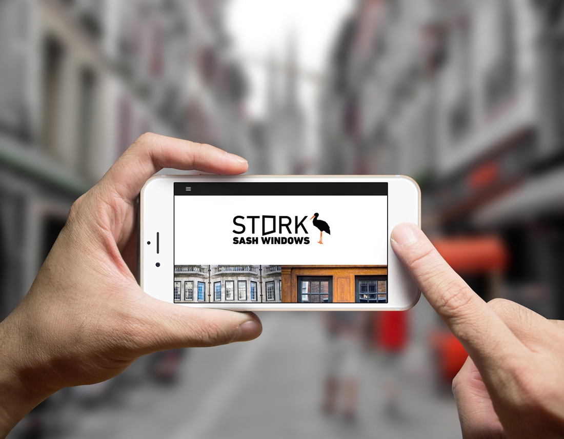
We made website design for STORK SASH WINDOWS – company, which makes heritage timber sash windows. Client wanted the website would look clean, minimalistic.
PROBLEM
There are many competitors in this niche. We analyzed many companies, which produce oak sash windows. Many of these website design are overcrowded by information, banners. Also, some already do not have responsive design what nowadays is pretty amazing too. Our task was to look through these examples, recognize, analyze problems and avoid them in our project.
WEBSITE DESIGN FEATURES
Fully responsive (is an approach to web design aimed at crafting sites to provide an optimal viewing experience—easy reading and navigation with a minimum of resizing, panning, and scrolling—across a wide range of devices (from desktop computer monitors to mobile phones), minimalistic and clean design. Timeless. An effective logo should be timeless – that is, it will endure the ages. Will the logo still be effective in 50 years? Hope grandchildren will answer it.
DESIGN ACCENT
Sash window – accent, which makes company exclusive. So we put the frame instead of letter o. Seems a part of the window is opened. Minimalistic design is common.
FONT
It was not hard to make a decision which font to choose making STORK SASH WINDOWS website design. We have collected tons of different fonts and after some time with our client, we have chosen font, which looks simple and clean.
COLORS
Black and white.
CONCLUSION
Firstly we communicated with our client, listened to him, raised all priorities and potential problems above, analyzed many competitors, created website design accent, selected the most suitable fonts and colors and in the end we left our client happy. But forgot to mention… Our client made us happy too, so we became partners. Also, we got good recommendations.
CREATIVE SHOCK poster design
- 1
- 2


